On February 26, 2015, an image of a black and blue dress went viral and took over the world. Social media outlets lit up in a fierce debate, disputing over whether the dress pictures was blue and black or white and gold. For days, debate raged on in what some called Dressgate. In the end, it was revealed to be a washed out image of a blue and black dress. This image and the ensuing buzz shows how sensitive our eyes really are and how complex even simple images can be.
For many of us, a slight change in color or visual contrast is no big deal. We may look at the image for a second, take in the information, and move on before we realize what we have done. But for some, this task could prove troublesome. Visually impaired students don’t have the luxury of gathering information by simply scanning. For them, taking in what little they can see is an arduous task. What may take a sighted person a few seconds of their time may take a visually impaired student a couple of minutes.
Creating a successful online course is difficult. Creating an accessible course can seem challenging, but it doesn’t have to be that way. Whether you are an experienced online instructor or you’re creating your first course, anyone can create an accessible course by following a few simple guidelines.
Contrasting Conflict
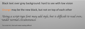
It’s difficult to imagine a person suffering from low vision. We see the world around us and probably never think twice about it. But to a person suffering from a visual impairment, seeing the world is a challenge. To understand some of the challenges a low-vision student may experience, try placing a piece of tracing paper over the following image. If you do not have a piece of tracing paper, try using a piece of Kleenex. You can also try turning up your monitor’s contrast levels to see an even more dramatic effect.
By looking through a piece of tracing paper, or Kleenex, you’ll notice the text and background become completely washed out and almost entirely unreadable. Even with the image in full screen, you’ll notice the word ‘orange’ is fairly difficult to read. The results are even more dramatic when the contrast levels are turned up. While it’s difficult to accurately portray how a visually impaired student will see, these simple tests will give you a general idea of what to expect.
PowerPoint Beware!
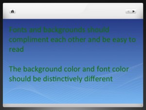
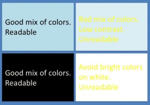
PowerPoint slides are generally one of the primary forms of communication in MOOC courses. However, poor contrast and design is one of the biggest contributors to accessibility issues in online courses. Consider the image on the left, which illustrates a few problems that arise when making presentations.
Using gradients are a common way to give a presentation some pizzazz and visual depth, but be careful not to choose a text color that may cause your text to be perfectly readable in one section and difficult to read in another, as seen from the images on the left. Although this could be problematic for sighted students to view, it is far worse, if not impossible, for low-vision students. When choosing a complimenting font color, be sure to choose a color that will stand out. If you use a light background, use a dark text. If you must use a template that has a dark background, say for instances your school colors, use a light colored font – white, cream, or light g
 rey.
rey.
If you are uncertain whether or not your PowerPoint presentation has enough contrast, try using this free Contrast Color Calculator. By using the RGB values of the colors you are thinking about using, this calculator can help you determine if your PowerPoint presentation will be clearly readable.
Over the next few weeks we will discuss more problems visually impaired students face and effective steps to help make your course more accessible. In the meantime, if you have any questions about accessibility, CIT can help. Our CIT staff will welcome the opportunity to meet with instructors to share ideas. Please contact CIT if you would like to learn more at learninginnovation@duke.edu


Ha. Some of those examples looked like material from online courses I took at a local community college. Was very difficult to make some of it out at times. LoL.
Great post. nice to meet you