Although the underlying core of “That’s Awesome” is to show great examples from online courses, I am compelled to write about something I believe is truly awesome! Imagine yourself living in a world without color and not being able to feel the emotional response color has on you. Color is so important to our every day lives that advertisers, graphic designers, and product designers make it a critical factor in their designs. The way we feel about a product can often times be heavily influenced by our reaction to color designers associate with the product. While we may have an emotional response to color, there are millions of people where color is simply a name. According to WHO, there are 285 million people worldwide that suffer from some sort of visual impairment that limits their ability to see color. For them, colors have no meaning.
For close to ten years now I have known someone who is visually impaired and in those years I have seen first hand some of the many challenges she faces on a daily basis. Although she is able to see and distinguish some color her ability to understand or appreciate color is non-existent. Sure, she knows the sky is usually represented with blue, the sun with yellow, and red for apples, but beyond that color has no meaning to her. Often times some colors are hard for her to distinguish. For example, if pink is more on the reddish side she will perceive the color as red or if navy blue is next to black she will often see the blue as black. It wasn’t until I took her to a visual disability store in Atlanta that I realized how much she often struggles with color. One particular item she was looking for was a device that would scan a color and verbally identify the color for her. She wanted the device so she would know what the color of some of her clothes were. One of her desires is to be be completely independent and not have to seek out others for simple things like choosing her wardrobe. Unfortunately, those devices are pretty expensive and even though there are apps now that use the phones’ camera, they are still fairly unreliable.
Universal Colors
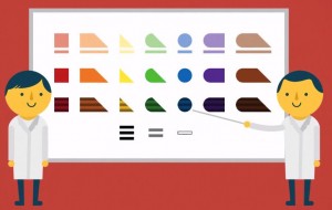
 Enter the Feelipa Color Code, a fascinating yet simple idea that surprises me no one has come up with before. Developed by product designer Filipa Nogueira Pires in 2011 and tested at the Helen Keller Center in Lisbon, Portugal, the Feelipa Color Code takes a Braille-like approach and makes a system of color representation using basic shapes we are all familiar with. The concept is simple: each shape represents a color and when you combine colors, a new shape is created. The code starts with the primary colors: square means red, triangle means yellow, and circle means blue. Black is represented by three bars, two bars for gray, and one for white. The color palette also takes into consideration different tints or color darkness, each having their own symbol. The idea behind Feelipa is simple — to make the ability to appreciate colors more accessible and inclusive. While the system hasn’t been adopted, Pires hopes one day schools will introduce Feelipa as a way to make the world of color truly universal.
 While the system may not work for the millions of different color variations, the fact that most, if not all of the basic colors are represented could really prove beneficial to those who need it most. Visually impaired people will always find ways to adapt to the color world, but with a system such as Feelipa that world could one day be a more inclusive color world. A world of color that you could virtually touch.

I guess it’s too easy for the majority of us to take colours and sight for granted. Your article has opened my eyes to a new way of thinking, I hope this new colour system helps your friend and millions of other visually impaired people 🙂